What if it's supposed to be bad?
Artists make choices. What if those choices are intentionally off-putting?

Vladimir Nabokov's 1962 novel Pale Fire is a book like few others. It features four sections: an introduction, a 999-line poem, a long series of footnotes commentating on that poem, and an index. The commentary is by far the longest part of the novel, taking up over 80 percent of its length. In it, Nabokov seems to presage the internet. In theory, one could read the poem, then skip ahead to individual footnotes within the poem, then follow the links between footnotes in a way that is very like going down a Wikipedia rabbit hole. (I, neophyte that I am, have chosen to simply read the book straight through.)
Nabokov was one of the most brilliant writers in the English language, so it does not surprise me to realize that Pale Fire can be read in any order and still function as a novel more or less. Indeed, what makes the book a "novel" is how it uses four separate nesting narratives within the "commentary" section to build out the world of the recently deceased poet John Shade (who wrote the titular poem) and his "friend" Charles Kinbote, the man who offers commentary on the poem and tries to twist it toward his own political ends. In some ways, the book feels like a response to the reception of Lolita, a book where it's tremendously clear that narrator Humbert Humbert is a criminal pederast, yet seemingly the entire critical apparatus of the literary world felt intent on ignoring that fact. (To be clear, I encourage any and all strange readings of any and all art. I just have to imagine it was very odd to be the man who wrote Lolita and watch as the conversation stretched it out into ever less recognizable versions of itself.) (Also, as you can see, I've taken my own reading of Lolita, then plastered it onto Pale Fire. The act of commenting upon a work creates a new, separate work, which is also inherent to Pale Fire!)
Yet when I go online to either talk about Pale Fire or research it for articles like this one, I run into a seemingly endless debate: Is the poem (henceforth "Pale Fire") in the book any good?
At first blush, the answer to that might seem to be "no," at least to modern eyes. The fictional Shade writes in rhyming couplets that can seem a little hokey. Yes, poetry that rhymes is still being written, but it's by no means the dominant form, and even then, few poems are written with as basic a rhyming scheme as "Pale Fire's." There are frequent sections that resort to bald doggerel, and the actual content of the poem at times seems to be whatever Shade was looking at outside his window, hastily slapped down on the page.
Yet the deeper I get into the book, the more that I think the answer is "The poem is basically fine." It contains within it several lines of stark beauty, in particular the very opening line ("I was the shadow of the waxwing slain"), and at times, Shade's use of couplets allows him to write with a naked honesty about, say, an extremely tragic event in his life. Yes, the poem goes on a bit, but it's also important to remember that we are reading an early draft and that if Shade had lived longer, he might have gotten it to a more recognizably "brilliant" state.
Of course, the question of whether Shade's poem is "good" is immaterial because it's not a question that really occurs to Kinbote to ask. Our commentator is so smug and certain of both his rightness and his righteousness that he doesn't bother with trying to sell the poem to us, choosing instead to force his preferred interpretation of the poem onto us. Particularly egregiously, Kinbote uses the poem's most nakedly personal section – about the aforementioned tragic event – to talk about various things from his own life. The truly brilliant thing about the poem within the novel is that whether you think it's brilliant, bad, or mediocre, the book still works. Indeed, it's not a slight on Nabokov as a writer if you think the poem is awful because the very structure of the book can support you absolutely hating the poem. It's an incredible trick, with a sleight of hand I'll be studying for as long as I write things.
Become a paid subscriber: You'll get access to two weekly newsletters only paid subscribers receive, the Episodes Discord, and almost a decade of archives. Sign up for as little as $5/month below!
Yet reading Pale Fire has also put me in mind of how many times across my career I've encountered an element of a work of art that stands out as jarring and discordant. Oftentimes, the online consensus around these elements will quickly settle on "that was bad," but too rarely does that consensus allow itself to go a layer deeper than that, to ask if the element is bad with intent.
Or, as I wrote in 2023:
The mistake I see a lot of new critics making is to assume that if they don't like a thing, then its existence was some sort of accident, rather than a series of deliberate choices by the artist that led to the thing they disliked. It's far easier to decide that you know better than the artist, that they are here to listen to you about where they failed, than it is to consider that the choices they made are just not choices that spoke to you. ... You do not have to like those choices. You do have to engage with them. You have to take the work seriously on some level, even if you're going to write an excoriating review of it.
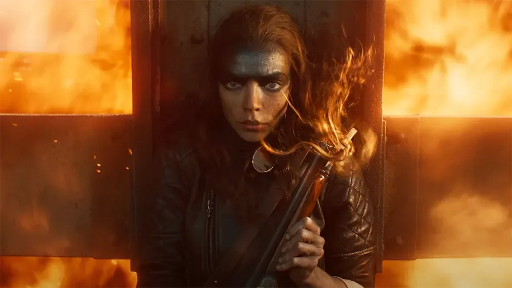
Consider, for instance, the visual effects in Furiosa, the 2024 prequel to Mad Max: Fury Road. These effects are much more impressionistic and even occasionally cartoony in comparison to the more grounded work in Fury Road, which rubs a lot of people the wrong way. By far the most common complaint against the film is that the effects are "bad." But are they bad, or are they impressionistic and cartoony? Do you want to bet that George Miller didn't know what he was doing when his effects ended up looking like that, or that he went with something that looked mediocre just because he was pressed for time? I suppose he might have, but it seems rather unlike one of the most exacting visualists in film history to do so. What seems more likely to me is that Miller chose those visual effects with a specific purpose in mind, one that we might be interested in speculating on. Miller's intent doesn't necessarily mean his choice was effective, but we're already having a more interesting conversation than we would be if we simply dismissed the effects as "bad" and left it at that.
Just because an artist makes a choice doesn't mean that it's the right choice or a choice that will work for you. But I often find that for a lot of critics and audience members, "This choice didn't entirely work for me" gets boiled down to "This choice was bad," which gets warped into, "Why didn't the artist realize this was bad? They must not get it!" I certainly don't want to say that artists can't realize what they're making is awful; indeed, most very bad things were made by people who thought they were making good things. But too often, we as audience members conflate our opinions with supposed blind spots on the part of the artist, when what's far more interesting is to try to figure out why Vladimir Nabokov might build one of the greatest novels of the 20th century around a poem that's kinda mid. (Sorry, Vladimir, but I must speak my truth!)
It is so easy as a critic to flatten one's enmity for a work of art into an utter dismissal of both it and the people who made it, but I always find it useful to ask if the artist was just doing something other than what I expected. Rarely will those artists hope that we find what they've done "bad," and it's always quite likely that a big swing will result in a strikeout. Still, I hope when you look at something that doesn't entirely work for you, you'll have a small voice in the back of your head asking if the artist meant for it to make you just a little bit uncomfortable.
Three things to read:
I found all three of these links worth checking out!
- The great TTRPG designer Jay Dragon asks a seemingly easy to answer question that ultimately reveals some really thorny, complicated depths: Does Super Mario Bros. have rules?
- As someone who lives in the world and loves to read books, I am so glad Andrea Long Chu exists. As someone who writes books, I hope she never notices me. Her utter decimation of Thomas Chatterton Williams's Summer of Our Discontent is a peerless example of how to write a negative review, with the following absolutely perfect takedown of Williams's frequently meandering sentences: "Editorial indulgence has resulted in such a sludge of footnotes and block quotes that the eye must often dismount and continue on foot."
- I do like that when you click on the link in those "need a job? work from home!" spam texts, you end up in a low-rent David Lynch movie. This article detailing the experience is equal parts funny and deeply depressing.
A Good Song
(What if this song is bad with intent????)
(No, just kidding, this song is one of the great human achievements.)
The free edition of Episodes, which (usually) covers classic TV and film, is published every other Wednesday, and the subscriber-supported edition of Episodes, which covers more recent stuff, is published every Friday. Paid subscribers also have access to the weekly Monday Rundown. This newsletter is written by Emily St. James, Libby Hill, and others. If you have suggested topics, please reply to the email version of this newsletter or comment (if you are a paid subscriber).